


How to Choose Tile Colours Based on Vastu
Choosing tile colours is not only a design decision but also an important factor that influences how a space feels and functions. In many Indian projects, Vastu principles play a key role in colour selection, especially for flooring and wall tiles that cover large surface areas. When applied correctly, Vastu-aligned tile colours can help create balanced, harmonious spaces while supporting modern design and performance requirements.
Understanding how tile colours align with Vastu helps ensure visual consistency, functional comfort, and wider acceptance across residential and mixed-use developments.
Why Tile Colour Matters in Vastu
According to Vastu Shastra, colours influence energy flow within a space. Flooring and wall tiles have a strong visual presence, making their colour impact more significant than decorative elements. Selecting the right tile colours as per Vastu can help create environments that feel open, welcoming, and purpose-driven.
Vastu-Based Tile Colour Selection by Direction
East-Facing Areas
The east direction is associated with freshness and positivity.
Recommended tile colours:
These colours help reflect natural light and are well suited for living rooms, entrances, and common areas.
North-Facing Areas
North-facing spaces are linked to clarity and prosperity.
Recommended tile colours:
- White
- Light grey
- Light blue
- Pastel green
Lighter shades help maintain openness and are commonly used in offices, reception areas, and shared spaces.
South-Facing Areas
The south direction represents stability and strength.
Recommended tile colours:
- Beige
- Light brown
- Muted earthy tones
Overly dark shades should be avoided across large floor areas, as they can create a heavy visual effect.
West-Facing Areas
West-facing areas are associated with consistency and balance.
Recommended tile colours:
- Cream
- Light grey
- Soft brown
- Neutral shades
These colours work well in bedrooms, dining spaces, and interior zones that require visual calm.
Room-Wise Tile Colour Selection as per Vastu
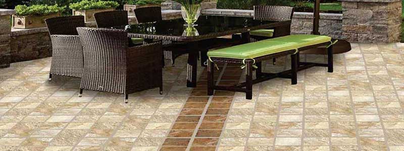
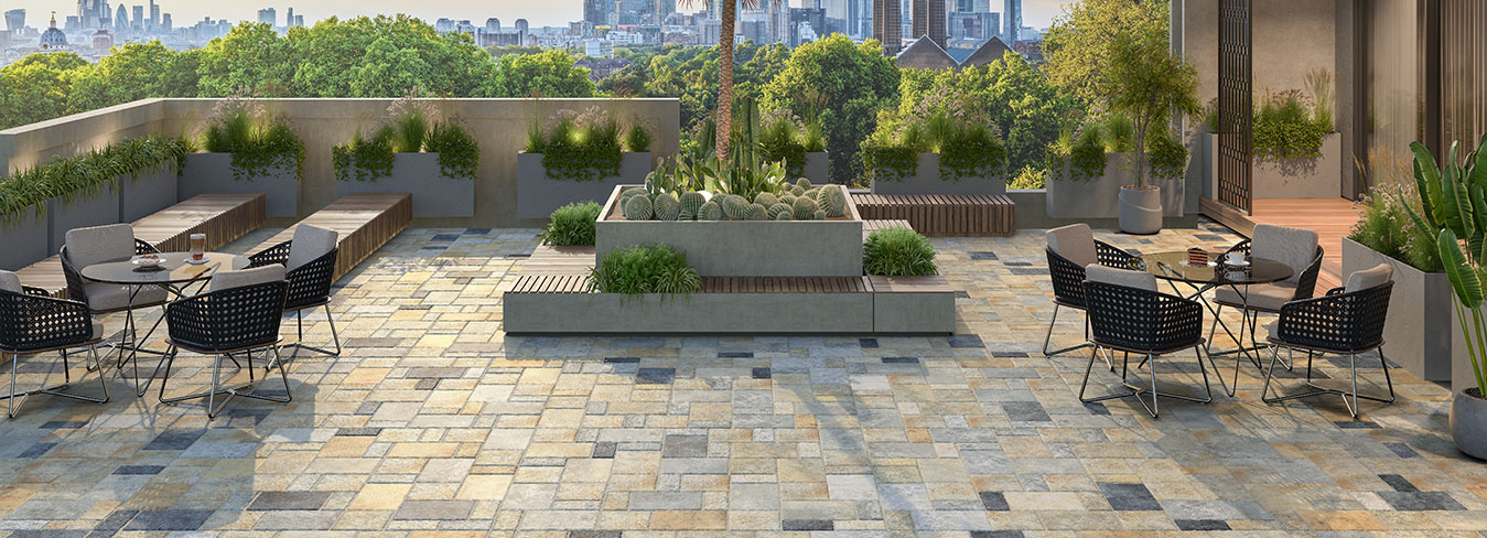
Living Rooms - Living rooms benefit from light and neutral tile colours that enhance openness and comfort. Shades like cream, off-white, beige, and light grey are commonly used as they align well with Vastu and suit a wide range of interior styles.
Bedrooms - Bedrooms require calming and subtle colours. Soft earthy tones, beige, and pastel shades help create a relaxed environment. Dark or high-contrast colours should be avoided for large floor areas.
Kitchens - Warm and light colours are recommended for kitchens. Cream, light yellow, and subtle earthy shades work well while also supporting easy maintenance and cleanliness.
Bathrooms and Wash Areas - Bathrooms benefit from light-coloured tiles such as white, cream, or light grey. These shades support brightness, cleanliness, and visual hygiene while aligning with Vastu principles.
Balancing Vastu with Practical Flooring Requirements
While Vastu guidelines are important, tile colour selection should also consider usage conditions, maintenance needs, and safety requirements.
- Light-coloured tiles should be paired with finishes that reduce stain visibility
- Matte or textured finishes improve slip resistance in wet areas
- Neutral shades offer flexibility across connected spaces
Balancing colour selection with performance ensures long-term usability.
Common Mistakes to Avoid in Vastu-Based Tile Selection
- Using very dark colours across large floor areas
- Ignoring room orientation while selecting tile colours
- Prioritising colour over slip resistance and durability
- Using inconsistent tile colours in connected spaces
Avoiding these mistakes helps maintain both visual harmony and functional efficiency.
Why Neutral and Earthy Tile Colours Work Best
Neutral and earthy tile colours are widely preferred because they:
- Align well with Vastu principles
- Offer design flexibility
- Perform better in high-traffic areas
- Support long-term maintenance
These qualities make them suitable for residential, commercial, and large-scale projects.
Conclusion
Choosing tile colours based on Vastu requires a balanced approach that considers direction, room usage, and functional performance. When selected thoughtfully, Vastu-aligned tile colours help create spaces that feel harmonious, practical, and visually consistent. A well-planned colour strategy ensures long-term value while meeting both traditional expectations and modern flooring requirements.


